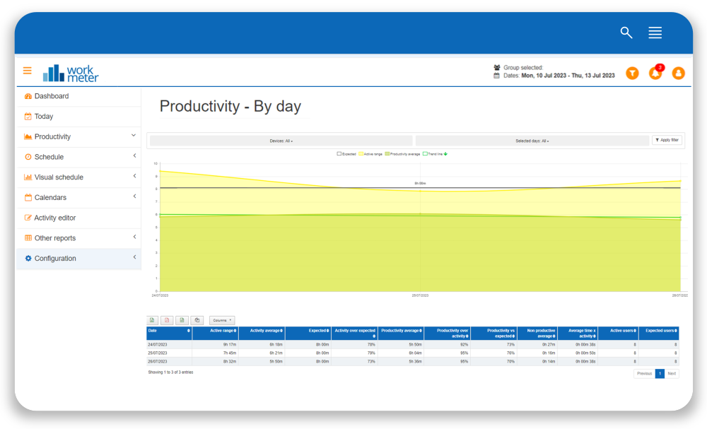
In this panel we show averages by employee group and breakdown of data by day
Let’s remember that “activity” is the time spent interacting with the computer (online time) or tasks outside of it (offline time).
- Date: indicates the day for which the data is shown
- Active range: average presence time of users included in the selected group
- Average activity: daily average activity of the selected users
- Activity over expected: level of achievement of the expected activity goal for the group, calculated by dividing the average activity of that group by the expected time.
- Productivity: total productivity hours sum for the selected date filter and group
- Average productivity: daily average productivity for the selected date filter and group
- Productivity over activity: level of achievement of the expected productivity goal for the group, calculated by dividing the average productivity of that group by the activity.
- Average unproductivity: average time spent on applications considered unproductive.
- Average time per activity: represents the employee’s concentration capacity. Shows the average time users in this group have remained uninterrupted in an application.
- Active users: number of users who reported that day and on whom all the previous averages are calculated.
At the top of this panel you have the option to "Filter by device" in case you want to show only the data collected by a specific device, such as only PC time, only offline time, only Android time, or only mobile APP time. By default, the information shows all devices.
In the graph, the green line shows us the Productivity Trend for the selected period and indicates whether our organization’s productivity rises or falls over time. Also, the icon at the top quickly indicates whether the trend is upward or downward. This icon can be especially useful when the productivity trend of our organization has remained very stable over time, and the green line does not show a perceptible variation at first glance. Just by looking at the icon we will know if our productivity is increasing, or if on the contrary it is decreasing.

