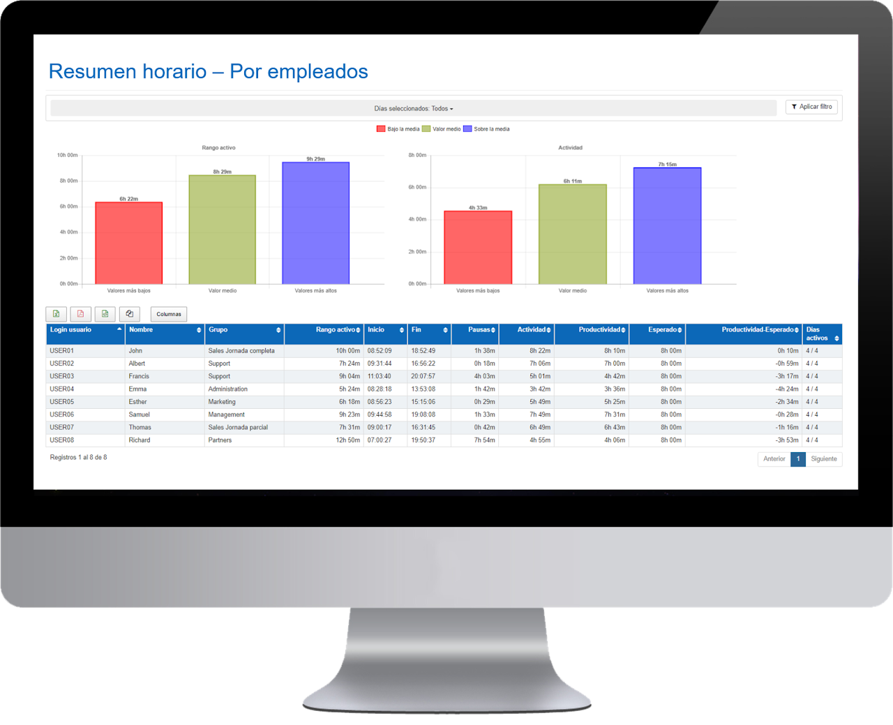
Schedule - Summary by Employees 🔗
This panel shows the average of the selected days and the breakdown of data by employee.
- Name of the employee.
- Group to which the employee belongs.
- Active range: average daily presence time of this employee for the selected days.
- Breaks: average daily break time of this employee for the selected days.
- Activity: daily average activity of this employee for the selected days.
- Expected: the expected daily activity that has been previously configured in the group to which the user belongs.
- Activity – Expected: obtained by subtracting the average daily activity minus the average daily expected. If the value is greater than 0, it indicates the overtime hours worked by the employee. If the value is less than 0, it indicates the time the employee owes to the company.
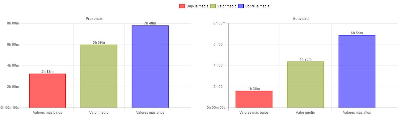
The chart shows the average of the top 3 users who are above the average and the average of the top 3 users who are below the average.
What happens if we have more or less than 3 employees? Regardless of the number of users, the average will always be calculated for a maximum of 3 users:
- If we have more than 3 employees, the average of the 3 will be calculated.
- If we have less than 3 employees, the average of one or two users will be calculated, depending on the specific case.
In this panel, we can also “group the data” so that only information from the groups is shown. If we group data instead of viewing user averages, we will see in the chart the 3 groups that are above the average and the 3 groups that are below the average.
- Group to which the employee belongs.
- Active range: average daily presence time of this group for the selected days.
- Pause: average daily pause time of this group for the selected days.
- Average activity: daily average activity of this group for the selected days.
- Expected: the expected daily activity configured for this group.
- Activity – Expected: average daily activity – average daily expected. If the value is greater than 0, it indicates the overtime hours performed by the group. If the value is less than 0, it indicates the time the group owes the company.
In the “Summary by employee” panel table, you will now find absolute values for the period of activity, productivity, expected, and difference.
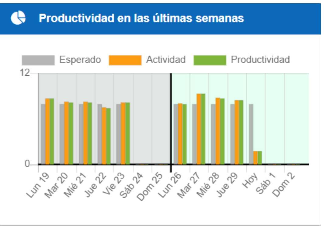
Effective work can be calculated based on activity or productivity.
When effective work is based on productivity, the chart shows a comparison of the last two weeks of expected, activity, and productivity.
When it is based on activity, it will only show expected and activity.
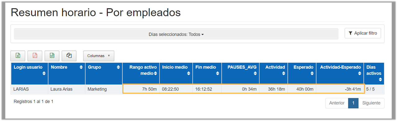
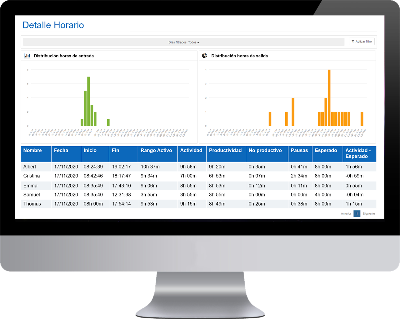
Schedule - Detail 🔗
In this panel we show daily sums and the breakdown of data by employees and days.
- Name of the employee.
- Date: specific day.
- Start: time of the first event of the day (usually PC startup).
- End: time of the last event of the day (usually PC shutdown or logoff).
- Active range: presence time. Calculated by subtracting the end time from the start time.
- Activity: sum of PC activity hours and offline activity.
- Productivity: sum of total productivity hours for the selected date filter and group.
- Breaks : total time during which no activity has been reported throughout the day.
- Expected : the daily activity expected that has been configured in the group to which this user belongs.
- Activity – Expected : average daily activity – average daily expected. If the value is greater than 0 it indicates the overtime hours worked by the employee. If the value is less than 0 it indicates the time the employee owes to the company.
- Productivity over expected : level of achievement of the expected productivity goal for the group, calculated by dividing the average productivity of that group by the expected time.
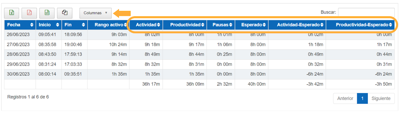
In the Schedule Detail panel, you can also view data related to activity.
By default these fields are hidden, but the activity columns can be shown by clicking the "Columns" button and selecting them.
This panel is where you will find all the necessary information for preparing the monthly employee report required by the Labor Inspectorate.
As in all software panels, you can export this data in various formats (PDF, CSV, and Excel). When exporting to Excel, the data appears in hours and seconds. To convert them to hours, simply add a new column next to the data you want to convert and divide by 3,600.
To print a report for a specific employee, you should select that employee, the start and end date of the month in the filter, and export it to PDF.
Data visualization
It is now also possible to sort data by more than one column, you can do this by pressing the Shift key and the column headers you want to use for sorting. You will be able to do this in all panels that have repeated sections like HorarioDetalle.
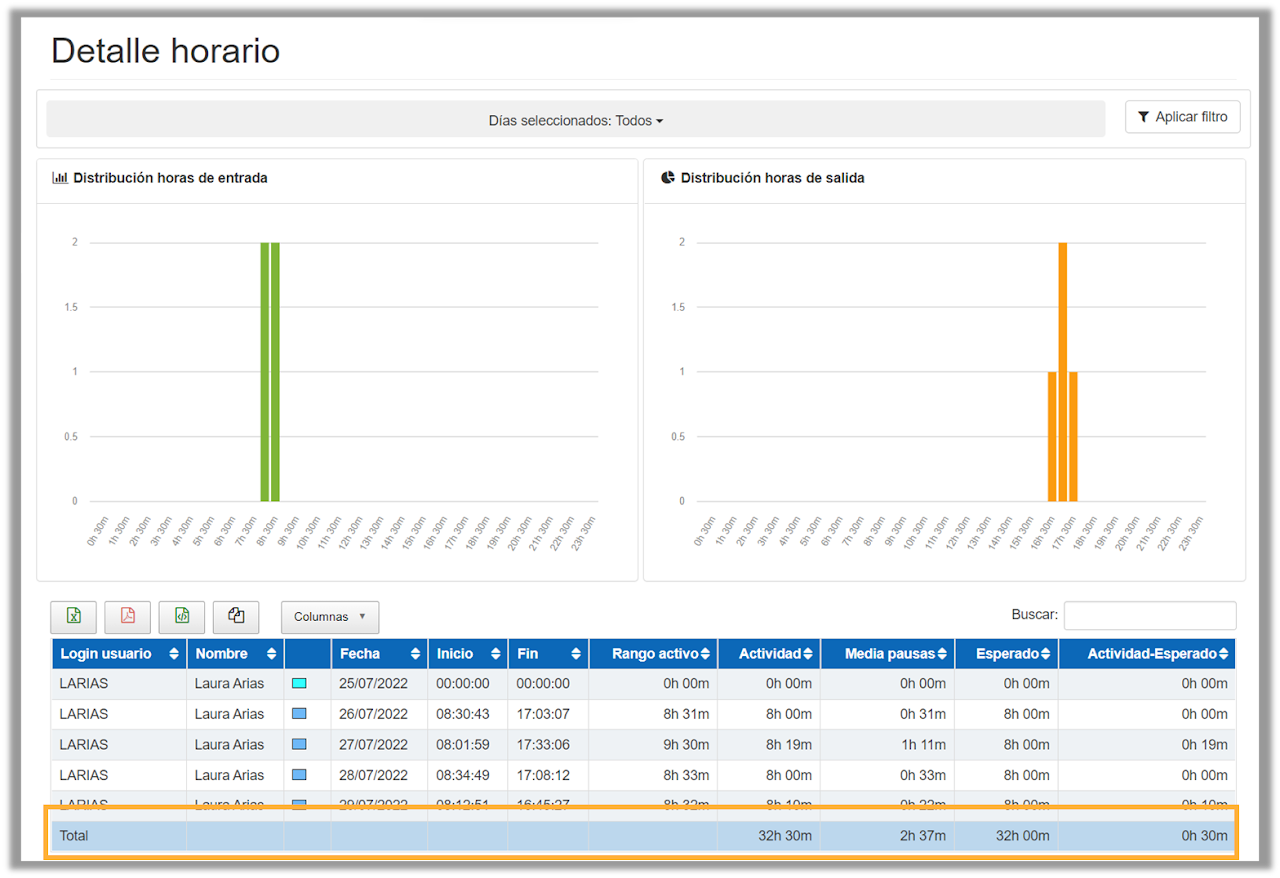
Inside the “Detail” panel of the “Schedule” section, when filtering by an employee, it is now possible to view the total times of activity, breaks, and waiting.
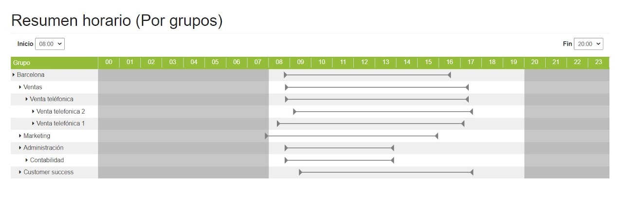
Visual Schedule - By groups 🔗
The tables contain expandable and collapsible sections to facilitate reading and understanding of the displayed data. Data can be expanded by group and subgroup, according to the information you want to view, you can also choose to see the active range of the groups or work departments of your company.
Visual Schedule - By employee 🔗
By clicking on the group of your interest, you can get the details of the employees who are part of the selected department.
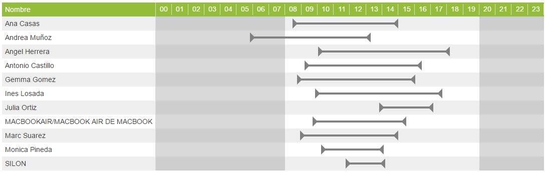
If you click on the gray line, the daily detail for that employee is displayed. The activity is shown in orange and the detected breaks in gray. If we click again, the daily detail collapses again.
Visual Schedule - Detail 🔗
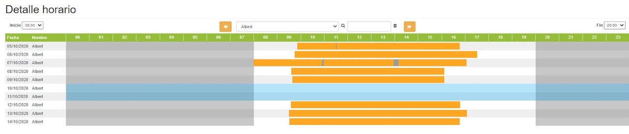
The graph shows us day by day the start and end times of the activity. The actual activity is shown in orange, the breaks taken in gray, and weekend inactivity in light blue. The sum of both colors gives us the total active range. Only breaks that exceed the minimum time considered as a break by the administrator (by default, 5 minutes) are shown.
The arrows allow us to switch from one employee to another. We can also select the employee we want from the dropdown.