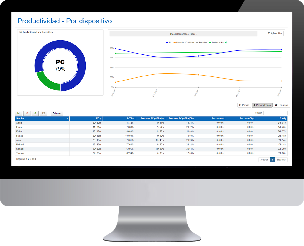
The data available in the table can be viewed by day, by employee, and by groups.

In this panel we show daily sums of the devices used and the breakdown of data by employee.
- Name of the employee.
- PC Device: sum of activity hours with the PC for the selected date filter.
- PC Device %: percentage of activity hours with the PC for the selected date filter.
- Device outside the PC (offline): sum of offline activity hours outside the PC for the selected date filter.
- Device outside the PC (offline) %: percentage of offline activity hours outside the PC for the selected date filter.
- Others: sum of activity hours with other devices such as Android or through the mobile APP. Other devices can also be integrated.
- Remaining %: percentage of activity hours with other devices such as on Android or through the mobile APP. Other devices can also be integrated.
- Total: sum of the activity hours from the previous three columns (PC + offline + others) for the selected date filter.
In the graph, the green line shows us the activity trend by device for the selected period and indicates whether our organization's productivity is rising or falling over time. Additionally, the icon located at the top quickly shows us if the trend is upward or downward. This icon can be especially useful when the productivity trend of our organization has remained very stable over time, and the green line does not show a noticeable variation at first glance. Just by looking at the icon, we will know if our activity is increasing or, on the contrary, decreasing.

